- Hue Change vs. Value Change
- Atmospheric Perspective
- Gradations
- What happens if you take value out of your colors?
- Using the Color Wheel
- Warm vs. Cool
- Color is always relative.
- Local Color (and of course Local Value)
- Color is influenced by what is around our subject.
- Broken Color
- Exercises you can practice at home
Color can seem confusing, magical, overwhelming, fun, vibrant, so many things. I encourage you to keep in mind, that when it comes down to painting and color, the value of the color is priority number 1, especially for beginners.
The more advanced you are the more you can push boundaries between value and hue shifts. But that is something you want to do consciously, knowing what you are doing.
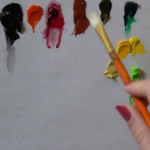
That being said, let’s get into the magic of color!
“When you go out to paint, try to forget what objects you have before you, a tree, a house, a field, or whatever. Merely think, here is a little square of blue, here an oblong of pink, here a streak of yellow.”
Monet
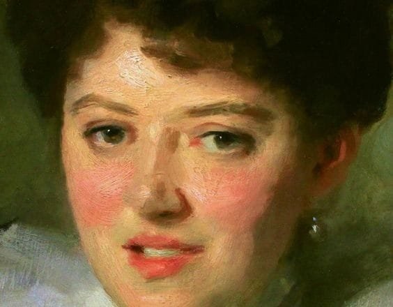
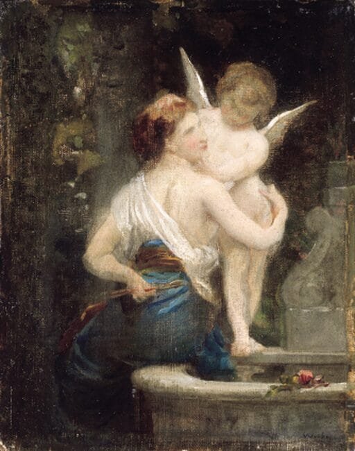
What do you see in terms of color in this watercolor by Sargent?
Take a moment to write down your thoughts on it.
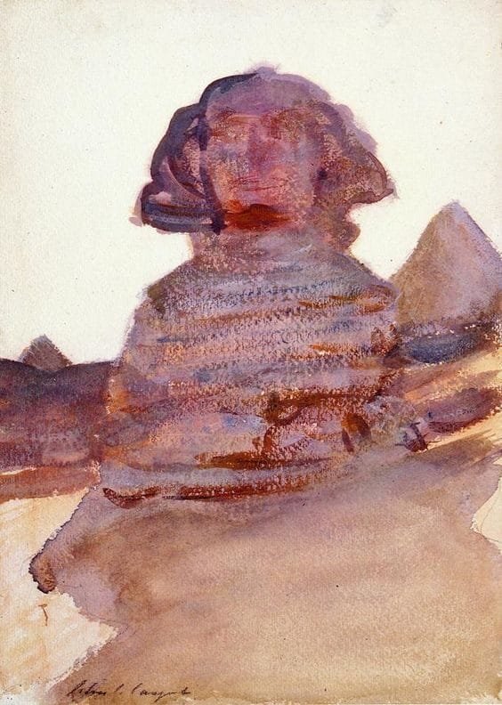
I hope that by the end of this article you will be able to come back again to this image and have an even clearer understanding or perhaps just to see new things that you missed the first time.
First, let’s start with the basics for painters.
When I write the word color, what do you think of? What does it mean to you?
To me, as a painter it means something that has a particular Value(how light or dark), a specific Hue (red, green, blue, yellow), and a certain Chroma (how saturated, or “vibrant”).
Sometimes I will also include the temperature-warm or cool.
*Pro Tip!
Paint and Light do not mix the same way.
If Orange Light, say from a sunset, mixes with Blue reflected Light, from the sky for example, then the result is a purple.
While if you mix blue and orange paint together you will get a brown!
Also a light and bright red, such as in a sunset is made with Light particles, but if you mix red paint with white paint trying to get a lighter brighter red, you will be mistaken, because you will end up with pink!
So be careful with remembering that paint and light do not mix the same way!
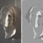
The first thing about color is being able to discern what is a “color” change-hue or chroma, and what is a value change from light to dark.


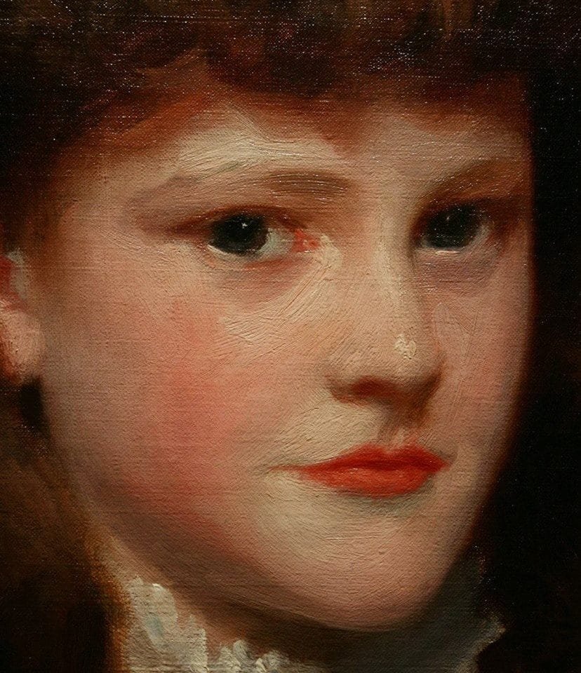
Hue Change vs. Value Change
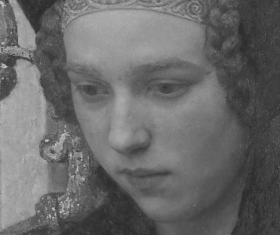
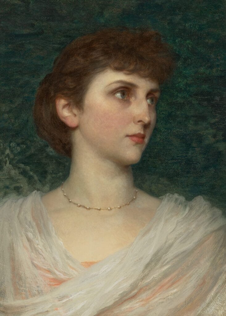
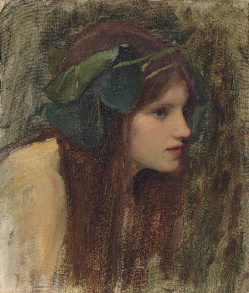
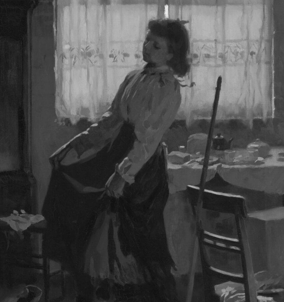
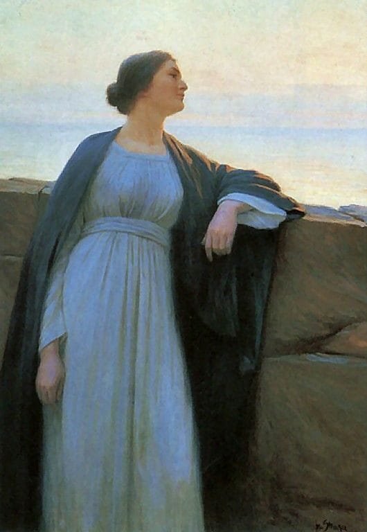
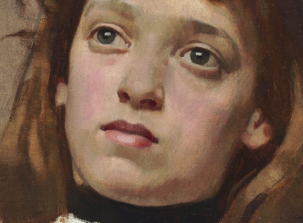
Here we can see in the woman on the left the strong pink in her cheeks. A common mistake beginners make when they attempt to show the pink in the cheeks is to show it as a value change as well as a color change. We must be able to discern the difference between a value change (lighter or darker) and a color change (hue and chroma). Here in Sargent’s portrait we see a strong hue and chroma change but not a strong value change, if any at all.
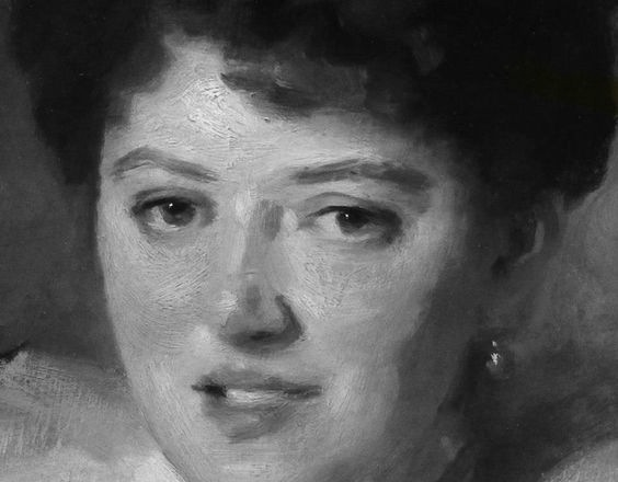
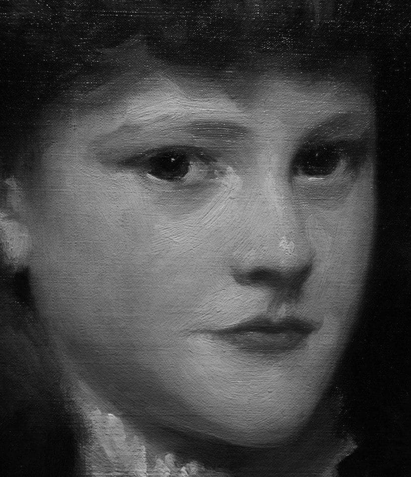
We must we able to see how much of the picture is made out of value changes. It is the most important element in the picture. We can see in the black and white image that almost all of the picture is described with value alone. The color gives us the extra things, like the pink of the cheek, the redness of the lips, the ochres of the hair, but the value changes give us the majority of the picture.
It really is very common to be distracted by color and to think that is equals a value change. Be wary of this. First prioritize discerning the value, THEN the color.


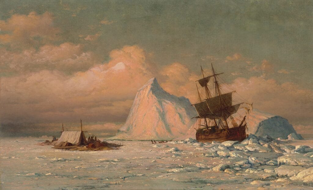
In this piece by Moran it could be very easy to think that the blue sky is very dark based upon how much the moon stands out clearly. But when compared to the dark boats the blue of the sky is still fairly light in value. The blue adds an additional separation from the clouds and moon to help the moon stand out more. It can be easily confused that this blue equates to a dark value when in reality it is only a subtle value change but a large color change.

In this portrait by Edgar Maxence we can see that while there is a slight darkening in value of the lips, the red of the lips does not create a large value change fro the rest of the skin. The common mistake beginners can make is to see that bright red and to try to show it by darkening the lips, especially when using drawing mediums like pencil or charcoal.
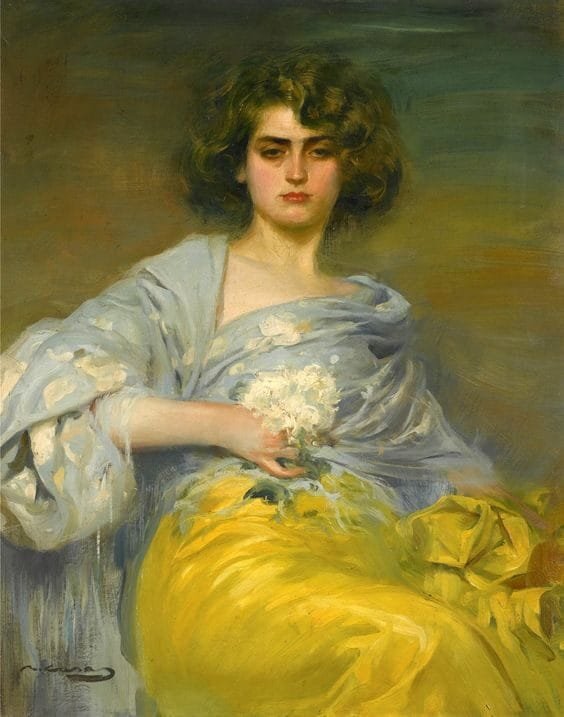

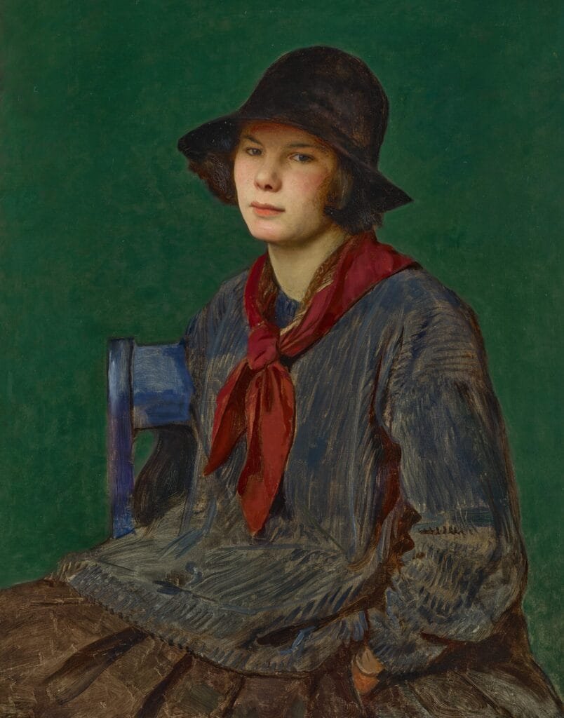
In this sassy portrait by Joaquin Sorolla, it would be very tempting to show the difference in the skirt from the shawl using value, but as we can see in the black and white version, it is mostly a color change, not a value change at all. Value-wise the skirt is the same value as the shawl. Please take a moment to soak that in. It is a color change, not a value change. We must be able to tell the difference at all times.
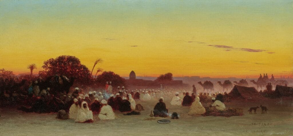
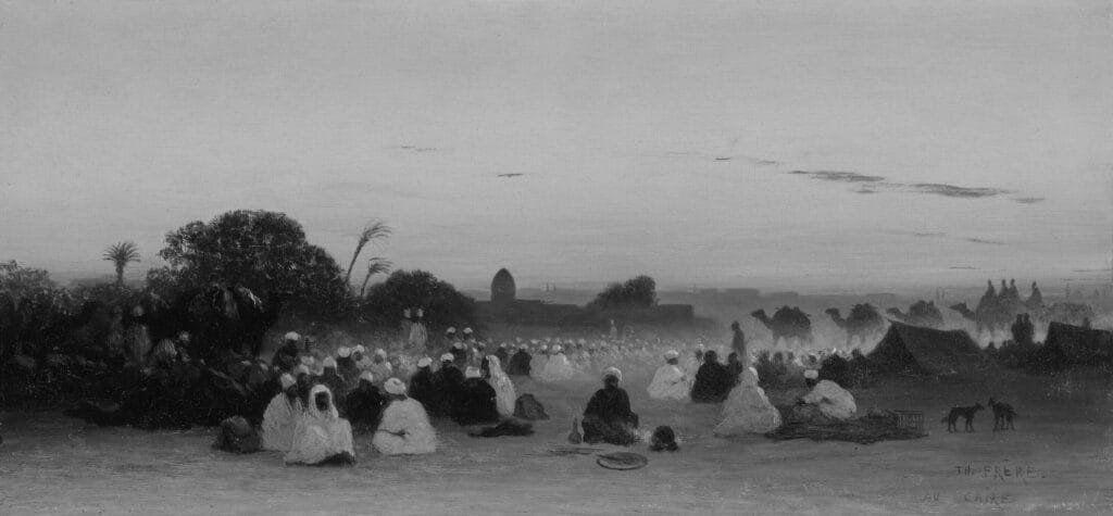
In this landscape of Cairo, the sky can be a challenge. Because the yellow of the lower half of the sky stands out more than the top half, it could be all to easy to think that the yellow is also lighter in value “brighter”, but is it really? In stead, it is actually slightly darker in value than the top half, but it is higher chroma which makes it stand out and feel “brighter” because it has a highly saturated hue.
Here are some other images to consider the difference between Value Change vs Color Change

Value only
Atmospheric Perspective
The basic thing to remember here is that to use atmospheric perspective in your work you simply want to have lower contrast as you go back into space. This usually means things get lighter as they go away from you.
Color also gets affected by this. Things are darker and Warmer the closer they are to you, and Lighter and Cooler as they move away from you.
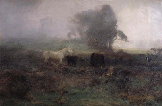
We can see both of these principles in the landscape below by Alfred de Breanski.


In this landscape by Harold Knight, we see the cliffs becoming lighter and bluer as they go back into space. You can think of it as our vision is being blocked by particles in the air, water, dust, sand, like a thin film of sky/air between us and the far away cliffs.
This is why often we find the atmospheric perspective produces sky like colors in the distant objects.
Pro Tips *
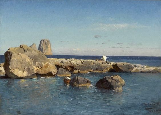
This is a great piece to look at in terms of shape design. The shapes created by the dark masses of the reddish rock island, the swirls that seem to move yet have structure at the same time-this is great by good large shape design.
For example just look at that Flow Through Line from the waves to the rocks. Simple elegance.
Or here, the connection and structure these waves and cliffs create.


Edward Lear

Here the effect is more subtle, but we can still see the value contrast is reduced the further back in space we go. The colors are also warmer, along with being darker, in the foreground (closer to us).
Below, also by Farquharson, the effect is exaggerated. This is due to fog which makes for a stronger effect.
Gradations
Gradations are both a compositional tool when designing pictures, as well as something that occurs naturally in the world around us. A great example of a common gradation is in the sky. We won’t only find gradations in the sky but it serves as an example of where we can easily see it in our daily lives. Another place to look for is on walls of a room.
Typically we will see some kind of a gradation from “top to bottom” of the sky, in our visual field. In the day time we might see the top higher up part of the sky be a darker higher chroma blue compared to the part of the sky closer to the horizon which will often be lighter and lower in chroma and perhaps even a warmer hue. Alberto Pasini’s landscape shows a perfect example of this.

In this landscape by Charles Theodore Frere, we also have a clear value and chroma change, along with a subtle hue shift from top to bottom. Pro Tip* Take note of how little information is given in the three figures under the tent. This is a great example of keeping things in the light defined more clearly with more detail, stronger contrasts, and sharper edges, while keeping things in the shadows soft, mysterious, low contrast.
Frederic Lord Leighton
In Leighton’s landscape study we can see a subtle hue and chroma shift from top to bottom. There is also a subtle value shift. The top is bluer, the middle sky is yellower, and the bottom is redder.
Pro Tip* This is also an excellent example of a landscape study with clear simple shapes and masses. Take time to look at this closely.
Here we also see a shift from bluer, to more greenish yellow to redder as we move from top to bottom. We also have a value shift from darker to lighter.

We can see the gradation effect in this portrait by Kroyer too.
At evening or sunset we may get usual or flipped gradations. We can also get gradations that move from left to right rather than from top to bottom.
We need to discern which are gradations in value and in color or a combination of the two.
Take a moment to look at the gradations in this piece.
What kind of color and value shifts do you see?

Gilbert Munger
What happens if you take value out of your colors?
Well, technically you can still make pictures, and they can be incredibly beautiful pictures at that. However, they will be a different style than traditional oil painting we do in class.
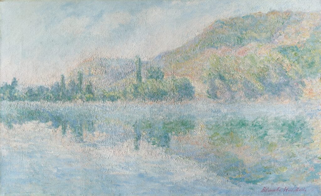
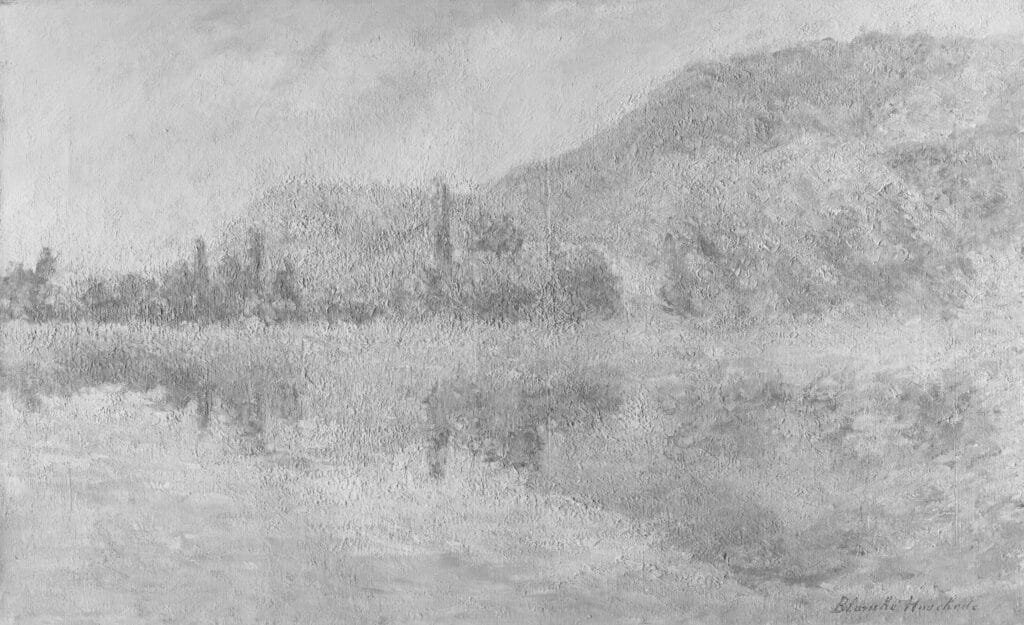
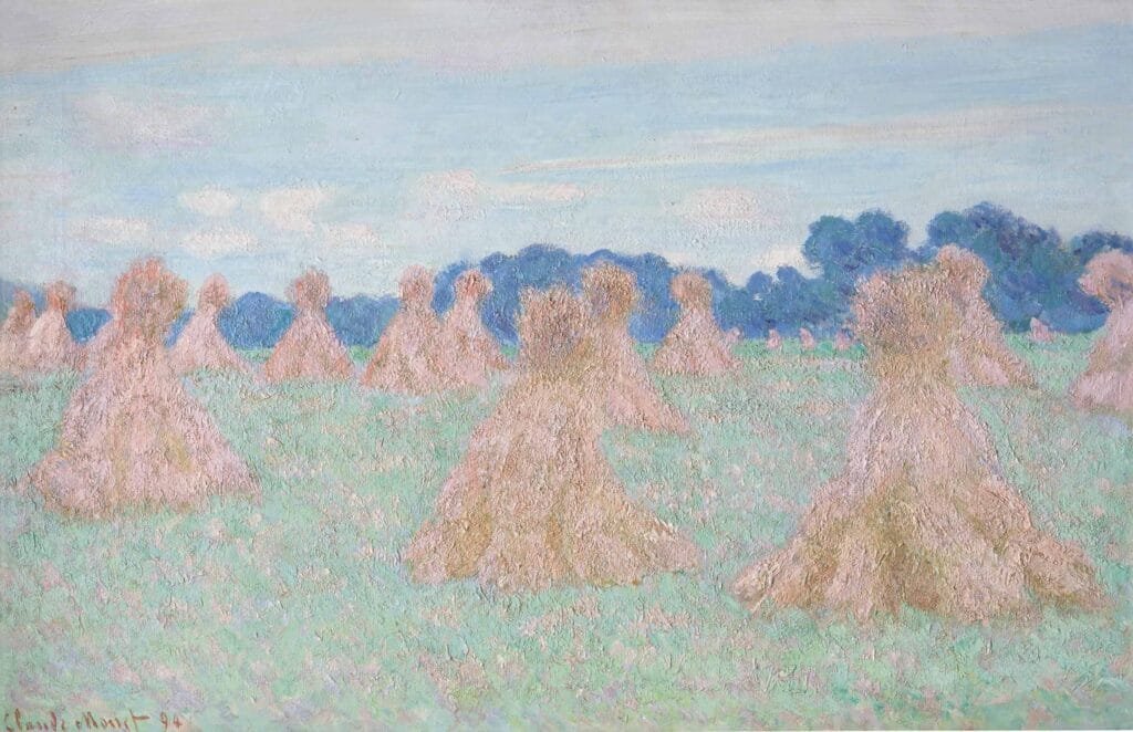
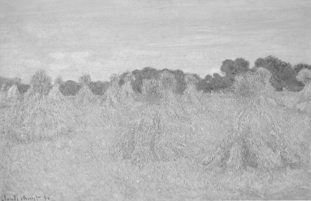
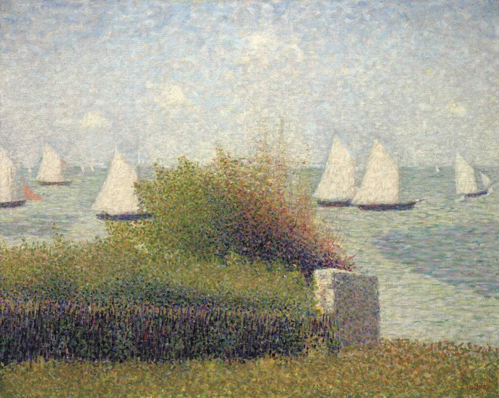
Here are some examples of Claude Monet’s landscapes that are nearly completely void of value changes. This is because the late impressionists focused on the color of light as their main subject.
While in all his pieces there is subtle value shifts, the main focus remains on the color shifts.
We can see this if we remove the color completely, so compare to the B&W versions. It is interesting to see how easily you can tell what is what in the color version, but it is nearly impossible in the value version.
This shows how he is using the minimum requirement of value shifts to explain his images.


Using the Color Wheel
You should have the color wheel memorized.
If it isn’t, then please take the time to study it so that you remember where colors are relative to one another.

Using Complimentary or opposite colors can create interesting compositions. The color opposite on the color wheel will make the other color feel stronger. Examples are Blue and Yellow, Green and Red, Orange and Purple.
There are many ways of using the color wheel in composition, such as Analogous colors which are colors sitting next to each other in groups of three-Blue, Violet, Red, or another group could be Blue, Green, Yellow, or another Yellow Orange Red, or another Orange, Red, Purple (a lovely combo!)

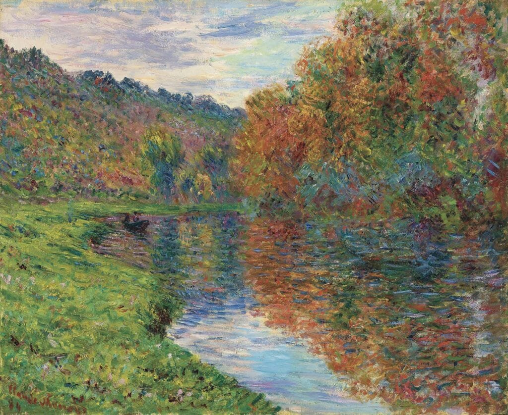
While this is a late impressionist piece by Monet which is a different style to what we do in class, it is still a good example of using the color wheel in composition.
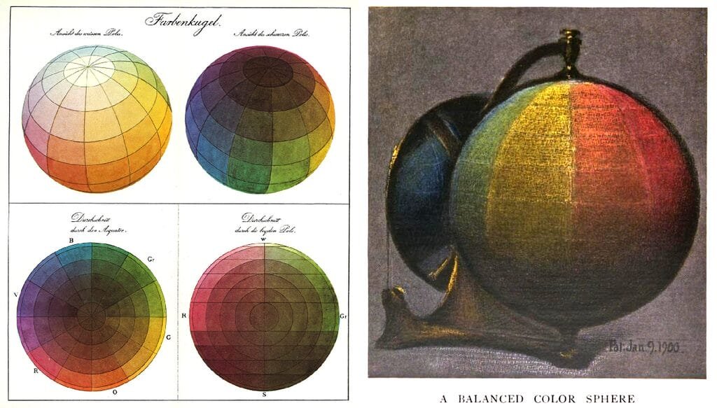
Depending on exactly which color wheel you use (there are a few different versions out there with more or less colors) for the most part we will be using the color wheel developed in 1867 by Charles Blanc.
So while blue and orange are technically complementary, here we have what I would still consider to be a complimentary color painting of blue and yellow.
However, we have a blue that is leaning towards purple, so it is teetering on purple and yellow which is the true compliment of each other.
We also have a few notes of slightly orangier notes within the flowers which gives us the blue and orange complements.
The yellows and oranges make the blue and purples more vibrant. In the same fashion, the violet blues make the yellows and oranges stand out.


Here is an interesting color study by George Frederic Watts with similar colors as Monet, though less chromatic. Here it is also interesting to see how much of the composition is explained with color alone.
So it is important to know what your values are doing and what your colors are doing.
Ask yourself:
What is doing the heavy lifting in your picture?
Does red and green always look like Christmas? Not at all!
Here in this lovely portrait By Sir Frank Dicksee, we have rusty reds with blueish greens. The reds shift towards the orange side of the red group while the green shifts towards the blue side of the green group.

While we have Green and Red here as the main color pairing, there are other colors here as well, primarily purple. This creates a color Triad.
Now does this mean these are the only colors the artist can use?
Not necessarily. First, we have all of the different values and chroma shifts we have use from each color. Then there are other colors as well. We have ochres and oranges in her face too.
However there are many light valued reds in her face which keep in line with the Red-Green-Purple triad.
Okay, I understand if things are sounding complicated here. It’s alright.
You don’t have to understand all of color theory! But it is useful for you to hear about it and know about it for if you ever need to use it more consciously.
These kinds of combinations are things that artists gravitate towards naturally. I doubt that the artist here consciously composes this whole piece thinking “Okay, let’s choose my Triad”. He likely just composed it in a way he thought looked good. But he spent many years developing his color picking skills so he chose wisely and we can learn from that.
While this piece by Lucien Dhurmer is more abstract than what we generally do in class, it is a great example of a work in Analogous colors: Red, Purple Blue.
Warm vs. Cool
This is sometimes included when artists think about color in general. The minimum components of color are
- Value
- Hue
- Chroma
The optional 4th is Temperature: Warm or Cool.
Warm and cool is always relative to what is around it. A color might be warm next to one color but cool next to another. The same can be said for value, hue, and chroma even. It’s all relative!
This all refers to the color wheel. Warm colors are Reds, Yellows, Oranges.
Cool colors are Blues, Purples, Greens.
But we can also have Warm Greens and Cool Greens, Warm Reds and Cool Reds, etc.
And example of a cool red would be Alizarin Crimson. A warm red would be a Cadmium Red.
A cooler blue would be Cerulean while a warmer blue would be Ultramarine.
It can be useful to put out a warm and cool version of each color on your palette.
A common principle many artists follow is if the light is warm then the shadows will be cool and vice versa.
In this piece by Thomas Moran we can clearly see the light looks very warm, meaning it has many yellows, ochres, reds, oranges in it. While the shadows are very blue and sometimes purple.

Here’s where things get interesting!
When we bring atmospheric perspective into the picture, the blue shadows get lighter as they go back into space and also have less purple (red) in them compared to the foreground.
But there are things happening to the lights as well, if you look at the the orange light in the distance it is also lower chroma and a touch cooler than the oranges in the foreground.
Typically in outdoor settings that is the pattern we will see, on clear days at least.
If it is overcast there will not be a clear difference between light and shadow because everything is technically “in shadow” from the clouds. In that case the local colors of the subjects tend to be the dominant color relationships (red shirt, blue boat, green grass, blue vase etc).
The color of things around the subject will affect the colors of the subject too. We see color because of light and light likes to bounce all around. We will likely see a bit of all colors in our subject.
Indoor lighting (say from a window) tends towards a cool light and warm shadows. This of course depends on the light source and the weather outside.
What kind of light is coming in affects the color.
Light itself has both color and strength. A candle is very warm and weak, while a hospital LED is very cool and strong.
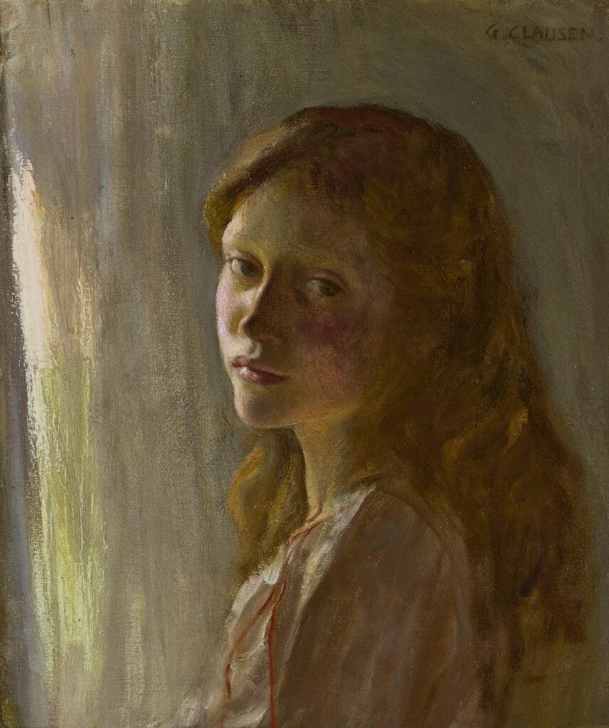
In the portrait above, by George Clausen, we can see slightly cool light from the window and warm shadows.
Color is always relative.
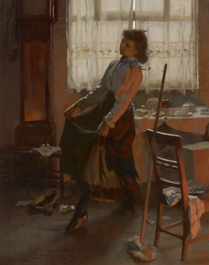
In this painting by Harold Knight it is an indoor seen so in theory we have warm shadows. However, something else is happening in this picture. Because of the very warm light from the fire (out of the frame) it makes the shadows on her seem cool in comparison. In other words, here we have a painting with two light sources, a very very difficult thing to do well. There is light from the window, seen nicely on her sleeve, and light from the fire. The light from the window is primary, it is stronger and creates the main division between light and shadow, while the fire light is acting both as a true light source but also as a reflected light. We can see that the artist explained the warm firelight with a chroma and hue change but not a value change. This allowed him to be able to keep the primary light source (the window) as the main source of light while also showing the fire.
*Pro Tip! In traditional paintings we always want to have only one main light source, especially when it comes to value organization. If two light sources the picture is likely to feel flat and 2D.
Think about it! It’s because we grew up on a planet with only one sun so this is how we developed our eyesight and learned how to navigate a 3D world. So things with one light source will naturally feel more 3D than things with 2 equal light sources.
Local Color (and of course Local Value)
While it isn’t always useful to think in terms of what IS and try to just think in terms of “What does it look like?” It is useful to understand the local value (how dark or light) and the local color of something.
In this painting by Waterhouse, the woman is wearing a red dress-this is the local color of the dress, red. The local color of the curtain is blue or navy. The local color of the wine is also red, but a slightly darker and more purple like red. The local color of her hair is brown, or gold, etc. This is Local Color, similar to a yellow billiard ball vs a blue ball.


In the black and white version we see the local value of the dress is darker than her skintone and the walls. The curtain is slightly darker than her dress but not by much. And the wine is much darker than her dress. The local value of her hair is similar to the curtain. This is Local Value, similar to the white billiard ball vs. the black ball.
Color is influenced by what is around our subject.
In this piece we can see the effect of the blue sky making the upper facing planes on her dress (chest, hip, wrist) even “bluer” than the rest of the dress. The blue dress plus the blue of the sky above become compounded into an even stronger blue. Meanwhile the downward facing planes (under side of chest, lower half of dress below the knees) becomes slightly more brownish-similar to the stone wall. We can also see the blue sky reflected on the top of her head.
Broken Color
This means that we separate a color into its various individual components. For example Green becomes broken by separating out blue and yellow.
Pointilism (not what we do in class) is an exaggeration of broken color. When we “step back” the bush becomes green, but on closer inspection we see the color is broken up.
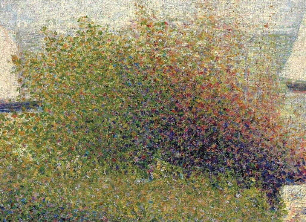
Monet is another painter who greatly used this technique.
To use broken color on a more subtle level we can see here in Robert Jobling’s portrait various ochres and blues and greys within her shirt. This is still a bit heavily textured for class but I think it shows well the idea.

In this portrait by Waterhouse we see a lovely subtle use of broken color in the background, this is a good example for using Broken Color in Class.

Exercises you can practice at home
1) A Warm and Cool Watercolor Tint
- To ease into things with color, just start with Warm and Cool.
- It doesn’t even matter which particular colors you use as long as one is slightly warmer than the other.
- You can use pencil and watercolor for this.
- Try making a pencil sketch and then tinting the picture with your warmer and cooler watercolor mixture.
- You will need a watercolor paper or pad for this. Any will do. Also multimedia papers work fine too.
- You can do this with masterstudy copies, choose any from this packet or on the forum, but you can also do this sketching from life.
*Pro Tip! Sketching from life is always a healthy and nutritious choice for artists skills.
2) Warm & Cool Color Studies In Oil
- Think of this exercise as a grisaille with warmer and cooler greys.
- This is a great way to learn how to do more with less.
- These can also turn into beautiful artworks for your home or galleries as well.
- Your palette is : Ivory Black, Titanium White, Burnt Umber.
George Frederic Watts, warm & cool grisaille
3) Limited Palette Color studies in Watercolor or Oil
- This is where you study the color relationship while keeping a simple palette
- The drawing should focus on mass, simple shapes and design
- This isn’t about making a miniature painting. It’s about trying to understand the colors in the scene in front of you
- It’s about the discipline of adapting the scene in front of you to a limited amount of pigments
- This practice emphasizes your perception of color relationships
- It’s one of the most useful, and most overlooked, exercises
- Your palette will consist of: Ivory Black, Yellow Ochre, Cadmium Red, Titanium White
- This is your core palette

4) Extended Palette Color Studies

- This is where you study the full color relationship in a picture or scene
- The exercise is like the previous, but you add a few pigments
- More color options, more complexity
- It’s good practice to begin with the limited palette pigments as your base and add to that
- Exactly which colors you will need, depends on the subject
- Example of an extended palette: Ivory Black, Yellow Ochre, Cadmium Red, Titanium White, + Cobalt blue, Viridian Green, Cadmium Yellow

*Pro Tip!
Remember to think in masses when doing color studies. It can be easy to get into details and symbolic thinking. Use this drawing by Fernand Khnopff as your Mass Inspiration.
It’s all about that abstract shape design!

*Pro Tip! Symbolic thinking can get in the way when we are drawing, such as when we outline lips, or draw hair as strings. But it can also show up with color too. Such as smoke-we might think of it symbolically as “smokey-gray, white”. However, in this scene by Peter Walker Nicholson, we can see it does have some greys, but also blues, and purples, and a few ochres.
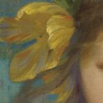
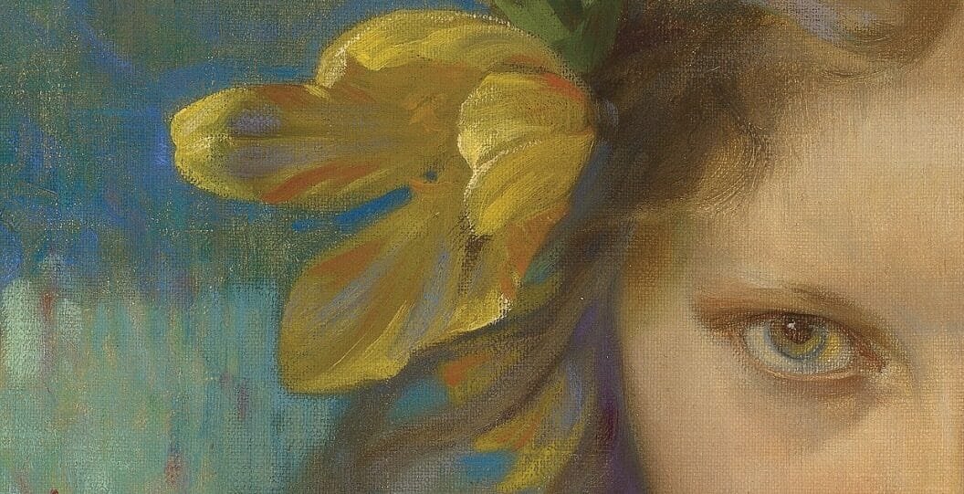
Another place symbolic thinking tends to show up in color is with the “whites of the eyes”. They are typically darker in value and more skin colored than we think.
In this piece by Harold Knight we can see that the whites of the girl’s eyes are nearly the exact same as her skin color.
This is a great example of painting in Mass. Each color and value change has a shape to it. There is a thought and a reason behind each brush stroke-lovely. This is an excellent example of what we should aim for in class for study purposes. For students in advanced levels we can move beyond this into other styles and techniques.
Happy Painting!